Why Most Event Websites Fail to Convert Visitors
Most conference websites suffer from a fatal flaw: they act like promotional brochures instead of conversion engines. Organizers spend weeks designing elaborate graphics, but bury the registration button beneath walls of dense text, unoptimized speaker PDFs, and confusing multi-page forms.
In reality, your event landing page has exactly 6 seconds to answer three fundamental questions for busy executives:
- What is this summit, and is it relevant to my industry?
- Who is speaking, and will I learn actionable intelligence?
- How much is a ticket, and how fast can I secure my badge?
Generate a High-Converting Event Page in Under 5 Minutes
Eventzone automatically scaffolds beautiful, mobile-optimized landing pages with integrated countdown timers, dynamic agendas, and frictionless EDAHABIA/CIB checkout.
Build Your Event Page Now1. The Hero Section: Above-the-Fold Mastery
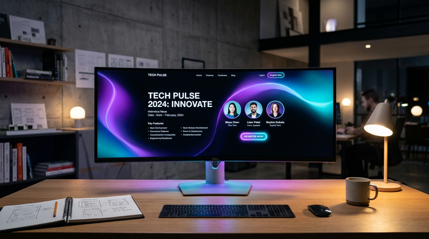
The top 800 pixels of your page determine 70% of bounce rates. A high-converting hero layout must include:
- A Crystal-Clear Value Proposition: Avoid generic slogans like "Shaping the Future". Use specific, outcome-driven headlines like: "North Africa''s Premier Summit on Energy Transition: Meet 45 Keynote Regulators and 800 Energy Executives in Algiers."
- Key Logistical Coordinates: Date, City, Venue Name (e.g., Nov 24–25, 2026 | CIC Algiers), displayed with unmistakable visual icons.
- A Single Primary Call-to-Action (CTA): A vibrant, high-contrast button like "Register Your Pass" that immediately opens the ticket selector modal.
- Live Social Proof Badge: A subtle counter such as "78% of Early Bird Passes Claimed" or "Over 400 Companies Registered" to trigger positive urgency.
2. The Speaker Grid: The Social Proof Engine
Attendees buy tickets primarily to learn from and network with industry leaders. Present your keynote lineup with professional visual hierarchy:
- High-Definition Headshots: Use consistent, professional square or circular avatars with clean, desaturated backgrounds.
- Prominent Company Logos: Display the speaker''s organization logo directly beneath their name. In B2B markets, brand affiliation is the fastest credibility shortcut.
- Session Topic Teasers: Include a one-sentence preview of what unique data or case study they will share on stage.
3. The Interactive Agenda: Tabbed & Searchable
Nobody wants to download a 12-page PDF schedule onto their smartphone. Build a clean, tabbed schedule organized by day and track (e.g., Plenary, Technical Workshops, Executive Roundtable). Allow visitors to filter sessions by topic or speaker, with clear duration timestamps.
4. Transparent, Multi-Tier Pricing Architecture
Eliminate checkout anxiety with side-by-side pricing tier cards (e.g., Standard Pass, VIP Executive, Student Quota). Clearly delineate what is included in each ticket tier: full luncheon catering, VIP lounge access, networking app matchmaking, and post-event slide decks.
"When ticket prices and perks are completely transparent, checkout drop-off rates decrease by over 38% compared to sites requiring attendees to email for a quotation."
5. Frictionless 2-Step Mobile Checkout
In Algeria, over 65% of conference landing page visits occur on mobile smartphones. Your checkout flow must require no more than three input fields (Full Name, Company Email, Mobile Number) before initiating EDAHABIA or CIB payment. Every unnecessary input field reduces conversion rates by 7%.
Conclusion
Your event landing page is the 24/7 digital sales representative of your summit. By combining razor-sharp hero positioning, authoritative speaker proof, and a streamlined mobile checkout, you convert casual browsers into confirmed, eager attendees.